
Qravers Installation
We recently sat down with our store manager Anaïs to talk about her inspiration behind the new visuals for Qravers in-store display.


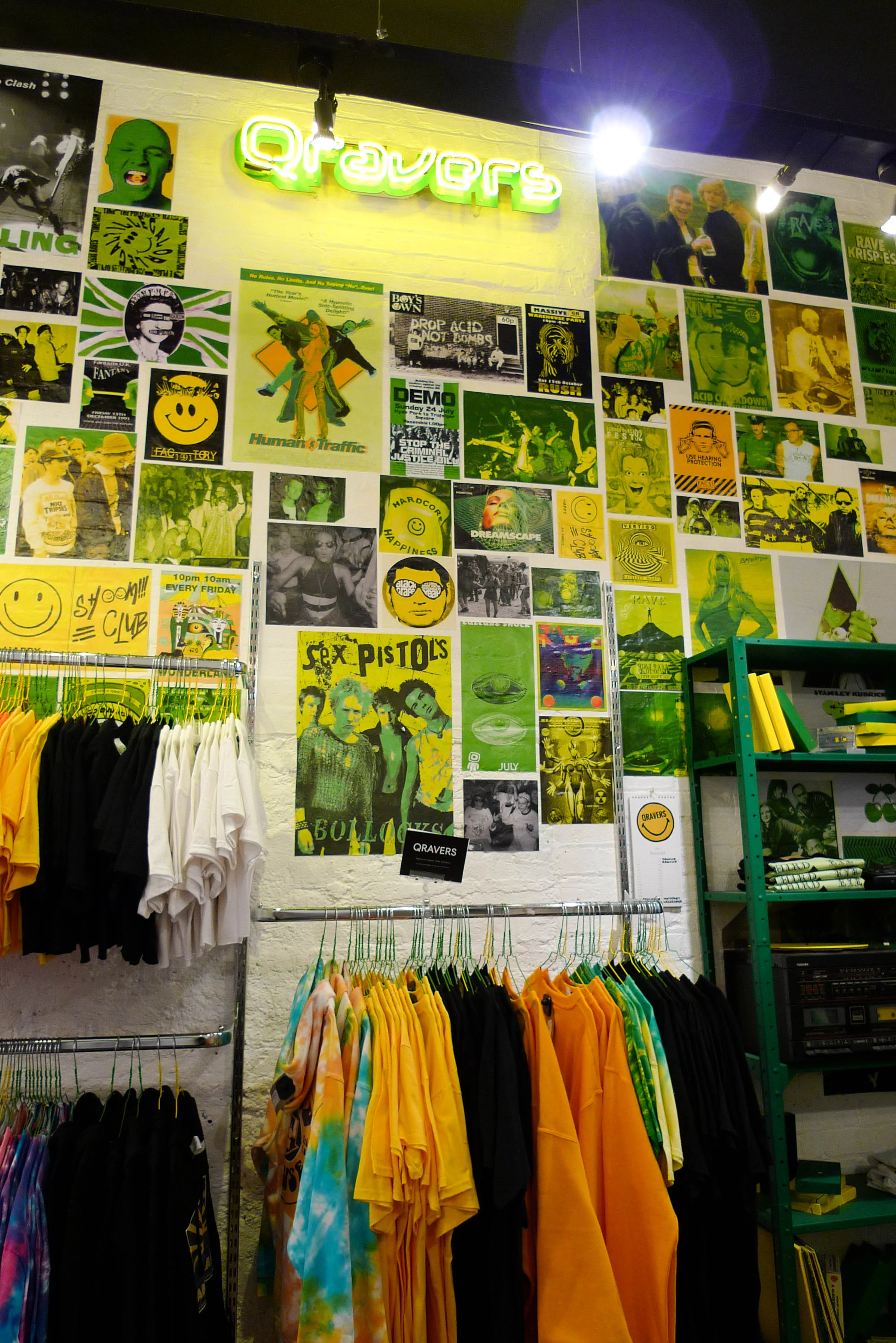
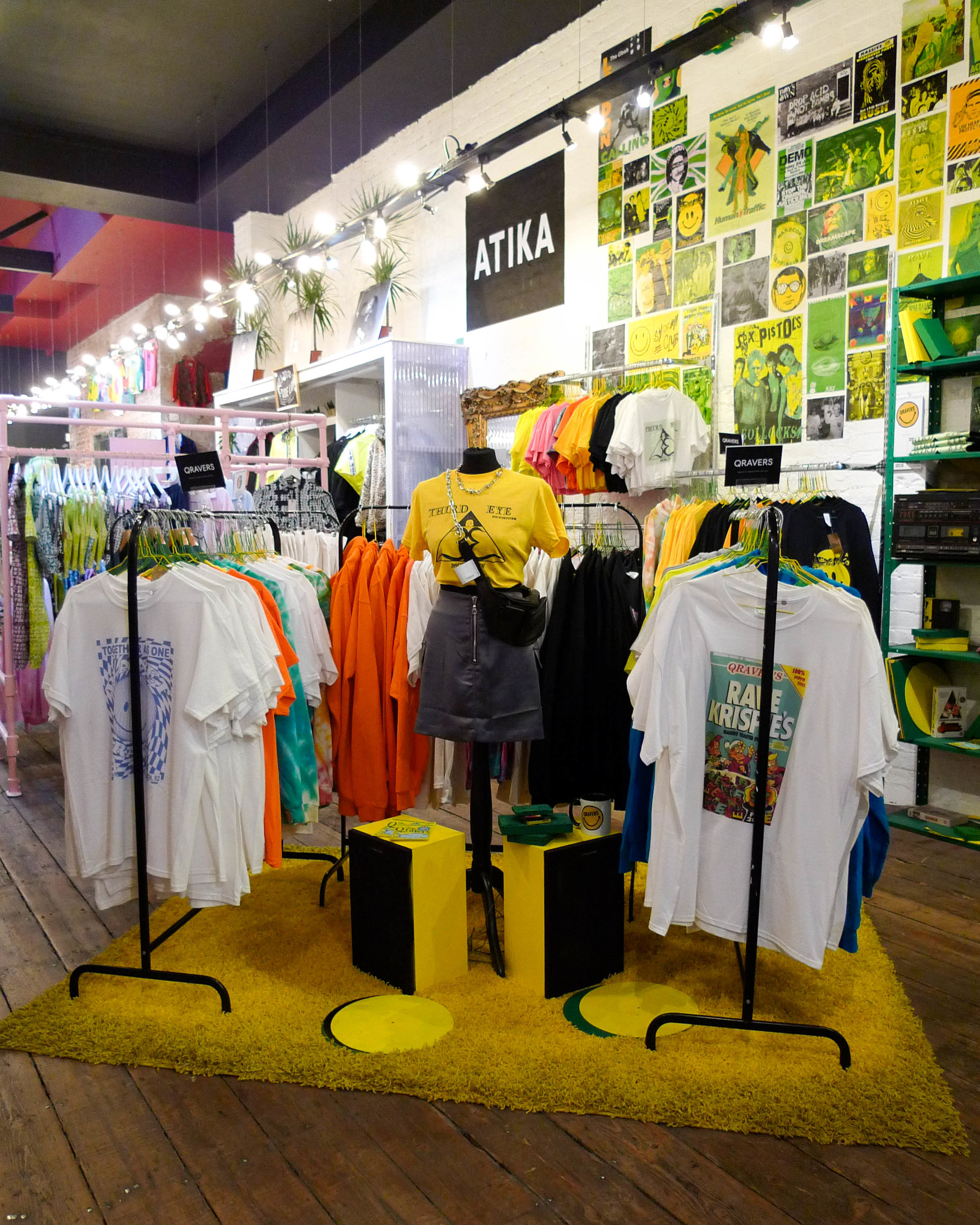
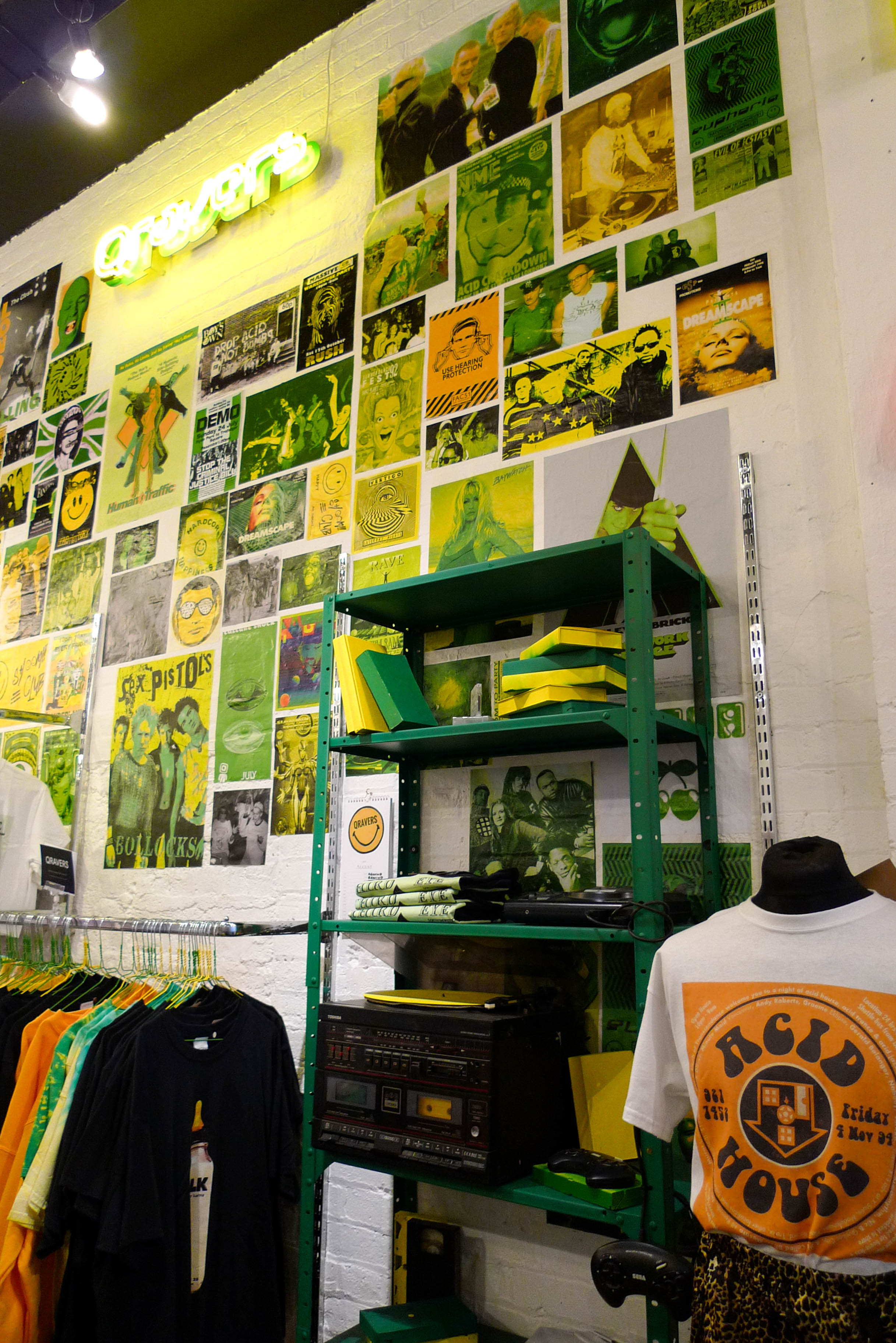
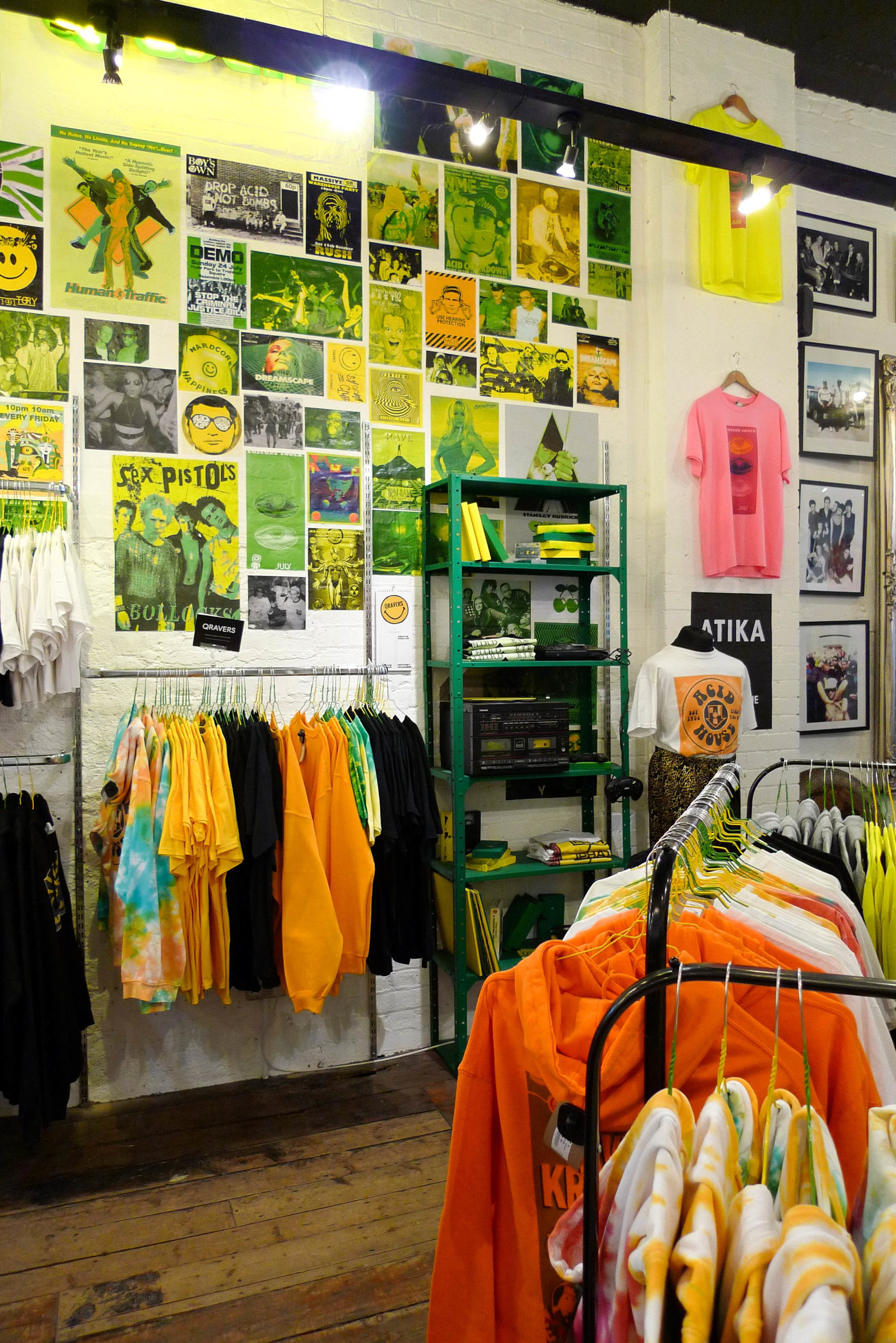
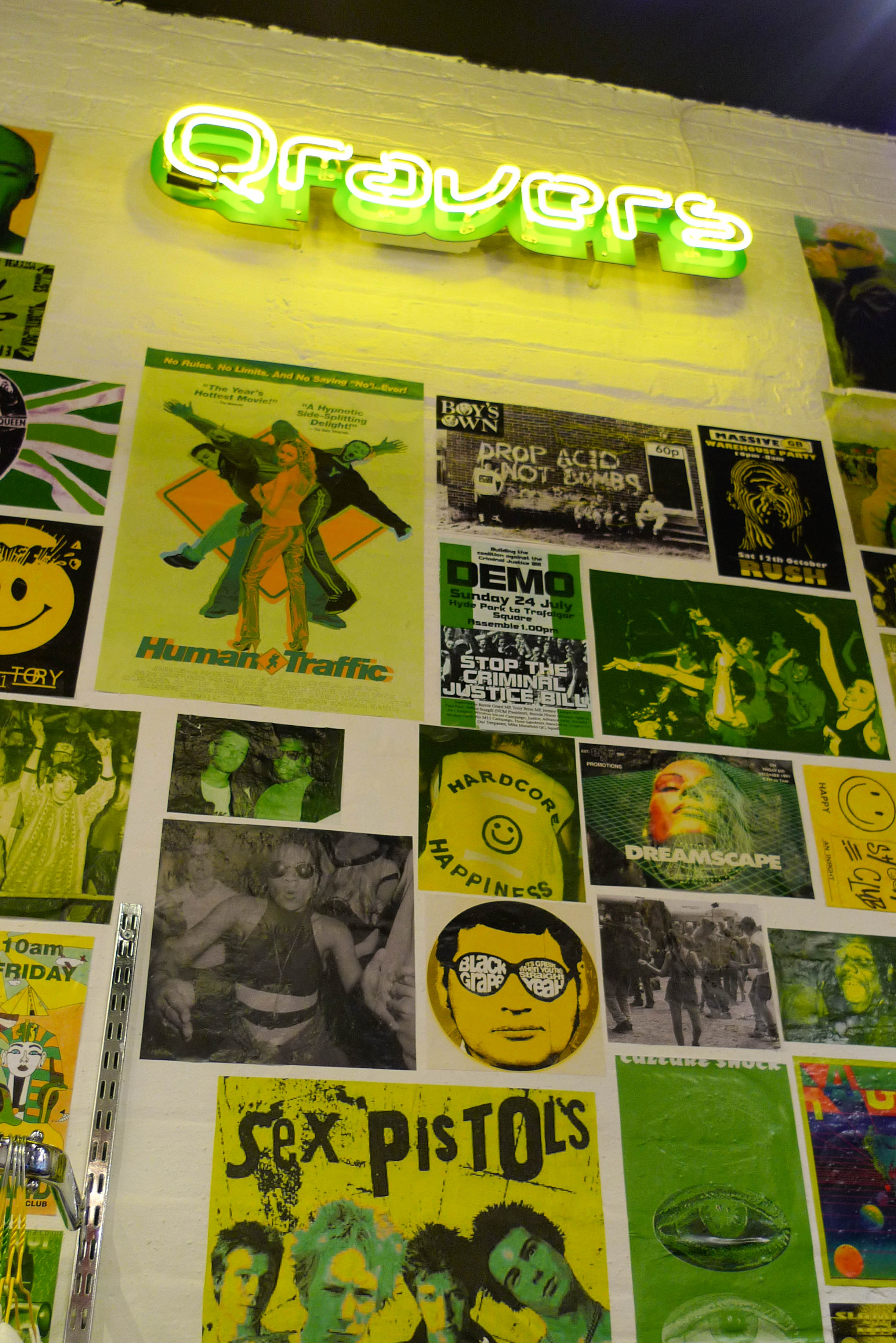
At first we wanted to do a teenagers bedroom but we didn’t have the budget or space. We decided to make the display feel like a geeky 90s kid would live in it. Making the space full of 90s references but also stuff before the 90s, as the teenager we pictured for this was 17/18 in the 90s. We wanted to make it a bit geeky and interactive for customers so that’s why there are lots of VHS tapes and records. We also wanted it to be messy, because it needed to be more of a realistic display.
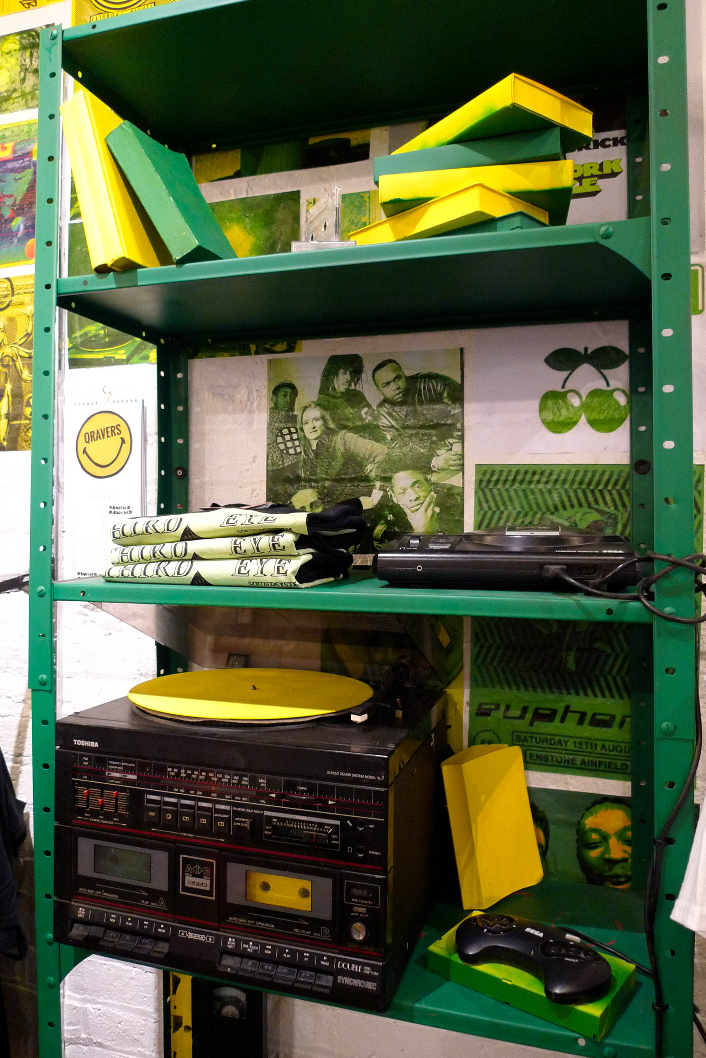
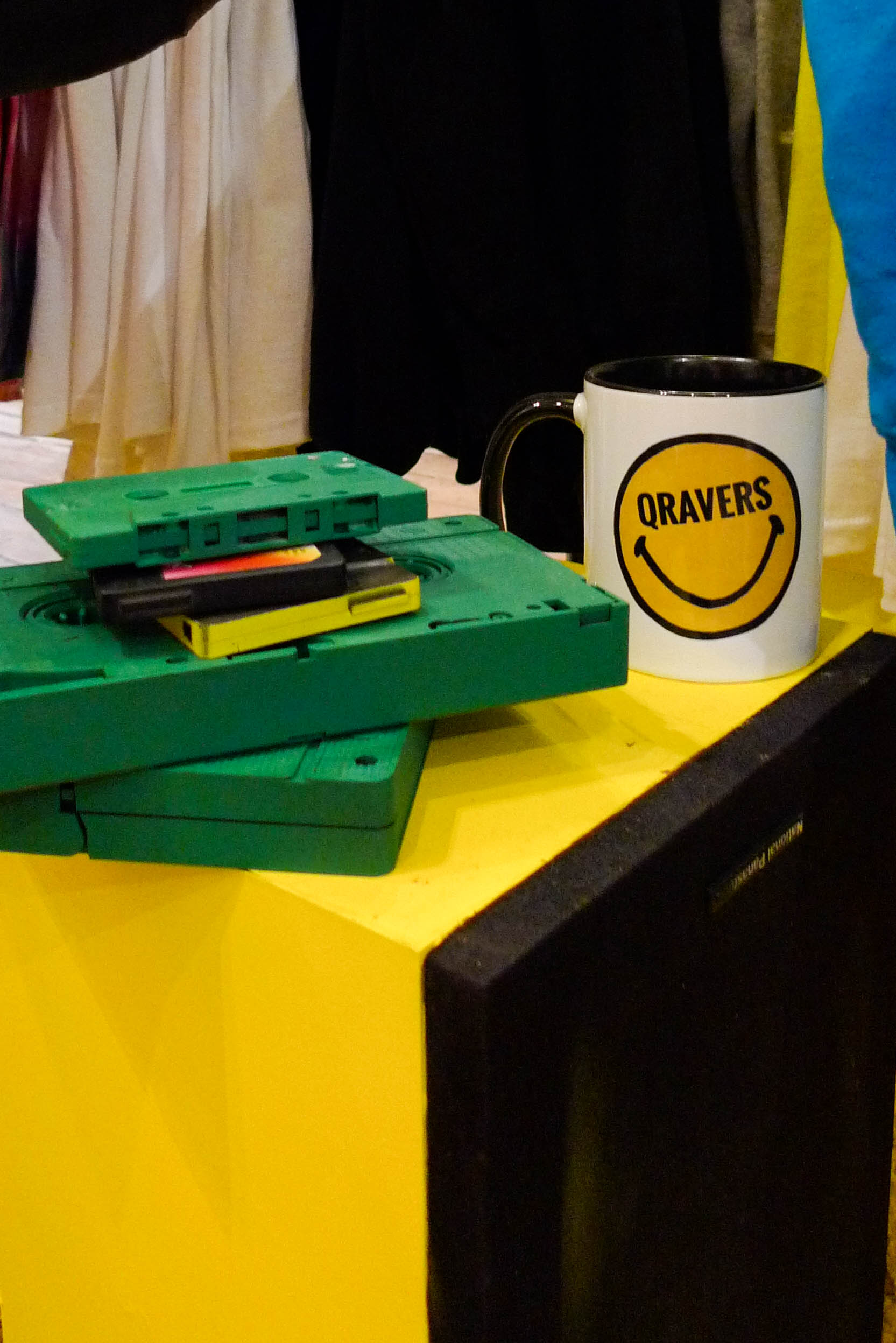
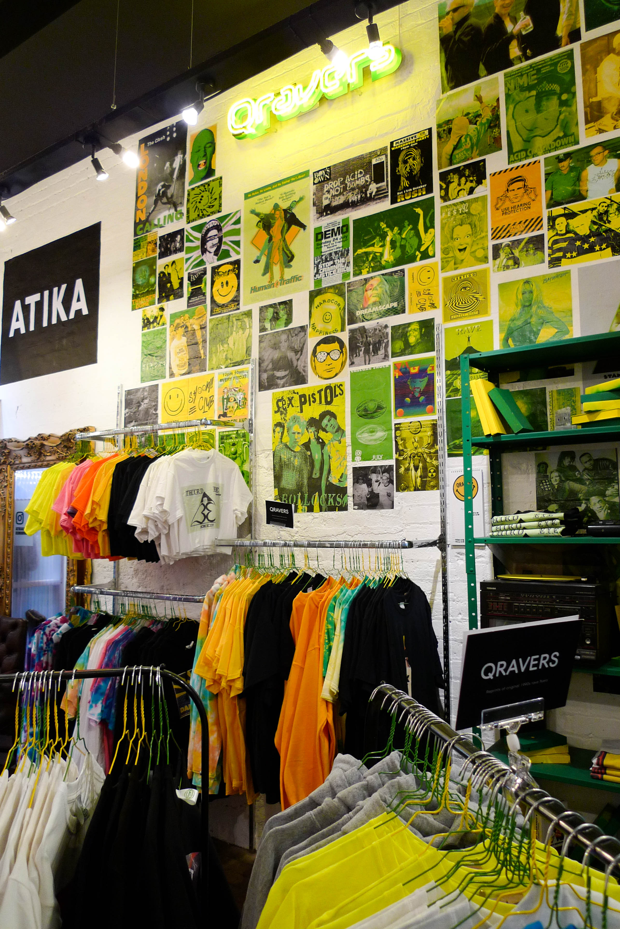
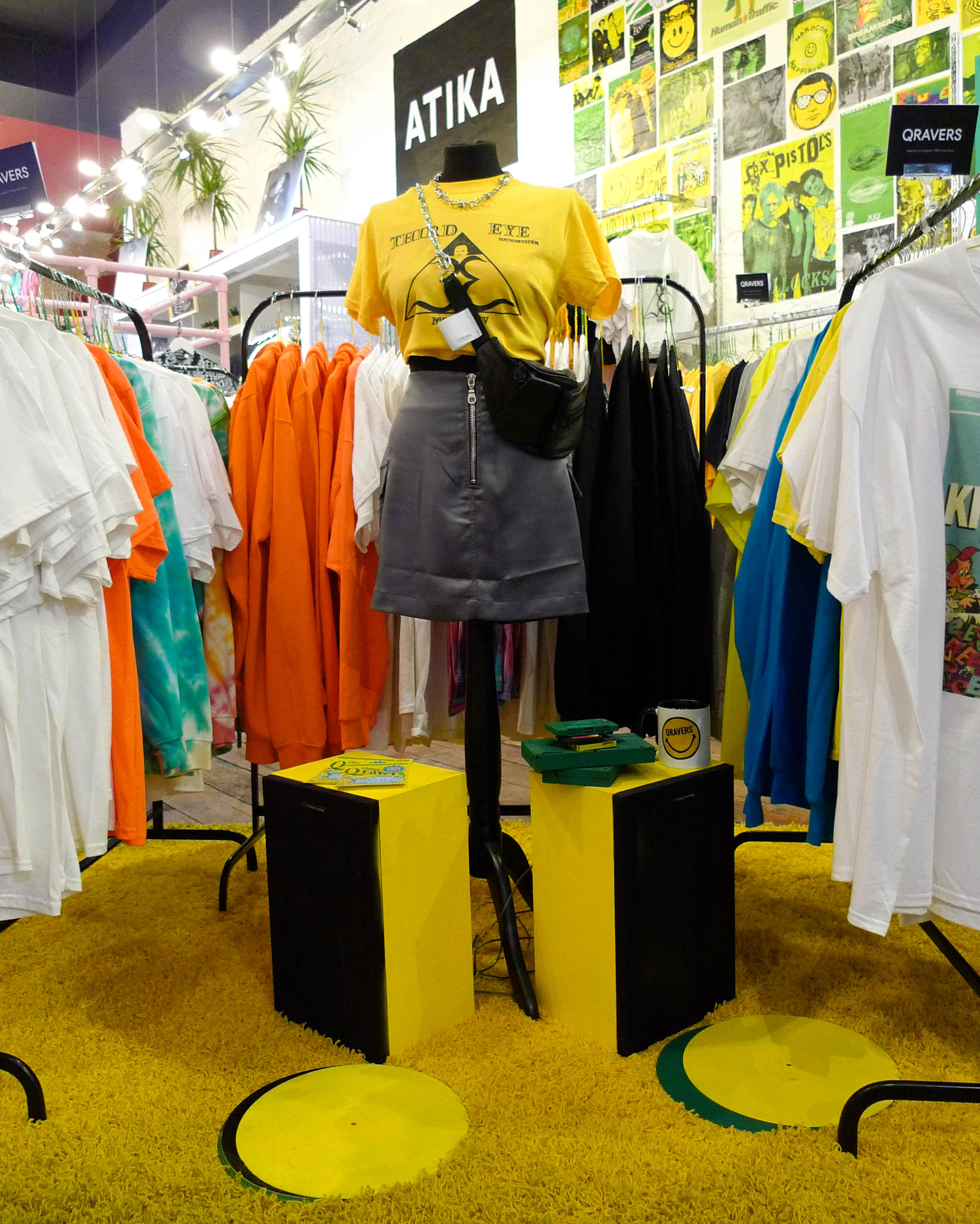
There is a lot of things visually that are going on. Like a calendar where Qravers have put down which festivals and raves, they will be attending/attended this year. Everything is really the Qravers customer. From the smiley face mug to it needing to feel like a teenagers bedroom, with elements of nostalgia from the 80s/90s rave scene. We’ve also got a massive neon light with the Qravers logo.
We really wanted to use just green and yellow and had looked at a lot of Gregg Arakis movies and saw how he represented bedrooms. For example, when you look at the film “Nowhere”, he’s really sarcastic and ironic about American teenagers. He’s so good at set design, and all of his rooms are teenage inspired but with things you never would expect. Just really cool inspiration that would give us more impact visually. Like sticking with x2 colours rather than doing something plain and obvious.
Images: Leanne Bebbington